Joanna Lamb was born in Perth and studied at Curtin University. Her work is held by the Art Gallery of Western Australia, TarraWarra Museum of Art and Artbank. Australian Art Collector voted her one of ‘Australia’s 50 Most Collectable Artists’. Joanna is also a member of Art Collective. Her take on suburbia really stands out in a crowd.
As a guest blogger on another site I offered this interpretation on one of Joanna’s works: Apartment 3 2010.
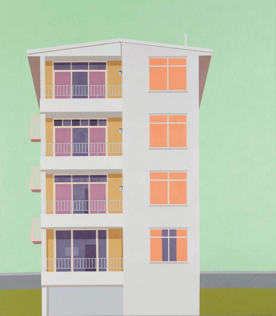
Apartment 3 2010 is a container that’s been flattened into a coloured pattern, or rather a tinted pattern that cannot quite be pressed into a human container. It is a block of ‘flats’. Why was it that I didn’t primarily see it as a ‘block’ of flats so much as one living unit stacked upon another, which is what a block of flats is? These sepia colours and frontal alignments do not let it pressurise itself as 3D very easily. It is first of all what might flatly hang on the wall of a flat rather than represent that stack of containers some of us live in. There is a remote pun at work in our apprehension of the word ‘flat’. It is the sepia colours, too, that fit with interior rather than exterior design, colouring the thin air around the vertical arrangement, or perhaps arousing the medium of a green smog that softens the impact of the sharp edges and makes it, the block, softly loom. That pushes it away from the obvious comparisons: Howard Arkley, Patrick Cauldfield, Roy Lichtenstein.
It is almost a plan rather than a habitation, a future rather than a past, but there is one unmistakable sign of living that is also a paradox. In all but the lowest window it looks as if there are no curtains. We just see pale orange interiors. But then the lowest window shows that the orange planes are all drawn curtains, for down at the bottom there the curtains have been drawn to reveal a dark grey interior. The interiors are not sunlit and airy after all, but rather the curtains conceal darkness, which hardly reveals anything. One flat shows a single sign of inhabitation, which doesn’t mean the other flats are empty. Their curtains conceal in a different way. We feel cut off from intimate places, which makes them more mysteriously intimate, or ready to just fall back into a design, something for a future that we have no involvement with, as these containers are unlikely to be anyone’s home for ever. We are units like they are.
Two further points. Point one. Along with its drawn curtains, the lowest flat has a different balcony window. It lacks the mauve panels of those above it. One can actually see into its living space to discover a grey noncommittal picture and a door. Actually its window frame is also of a different shape from those on the other floors. But wait a minute: all the window frames are slightly different in their proportions and the number of panes on their top section (just as the distribution of shadows beneath the balconies and degrees of glassiness on these living room windows are finely graduated). But oh no they’re not. Floor two and floor four have the same shaped window frames. Nevertheless there is a ripple of individuation up the stack contesting the monumental sameness. Did the owners, the architect or the artist ensure this?
Point two. Sameness comes back with the tiny green panels fixed on the beige panels to the right of the balcony windows. What IS that? (I mean in ‘reality’.) Each tiny green rectangle is given a shadow at the top which grants it volume (though whether as a solid or a void I cannot say), but since it is also the same tone and hue as the green sky it is like a vertical series of holes that go straight through the building and turns it into a cardboard cut-out, EXCEPT that it’s missing from flat one. The eternal tension between solids and voids again, reality and dream.


